Columns is a list manager.
Not a task
manager.
Ok, you can use lists for tasks but it's more than that.
List manager is an app for organizing lists, obviously. Why lists? Who even cares?
Those guys are:
Those guys are:
Yeah, they don't endorse Columns 😬. At least they are into lists.
Lists are great for organizing things and seeing the big picture. They're perfect for planning, tracking, noting, managing and thinking.
It is like mind maps but organized in a linear, column-based structure.
Ok, examples:
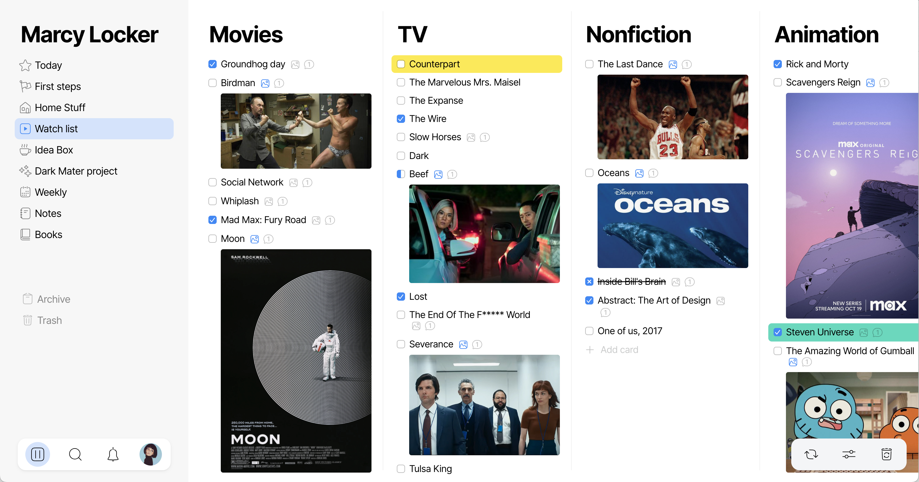
Make a list of movies you want to see
Maybe it's not the best example, but the screenshot is good looking.
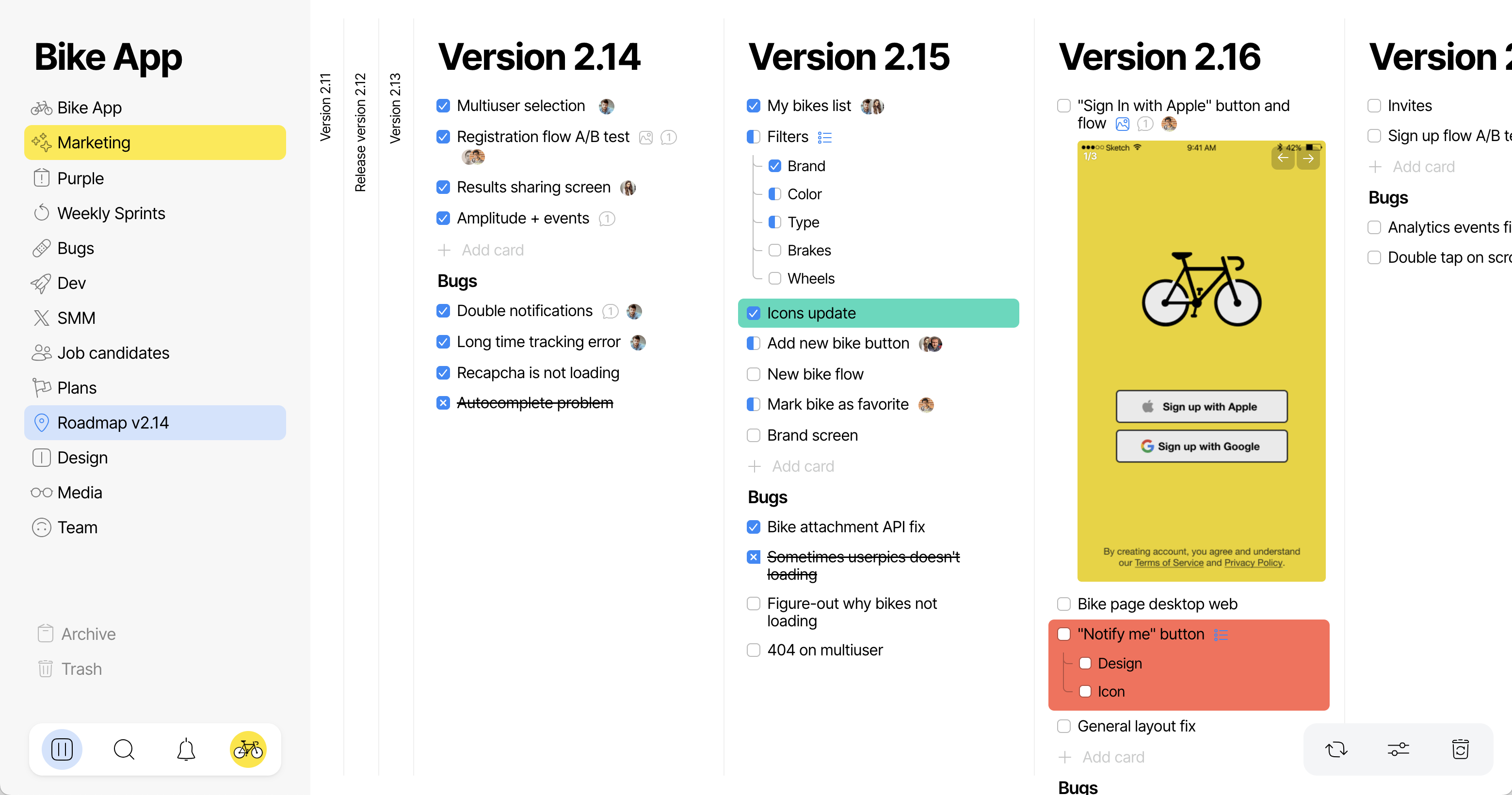
Create a roadmap for your project
Planning is the thing for lists, you can overview all stages and see the big picture.
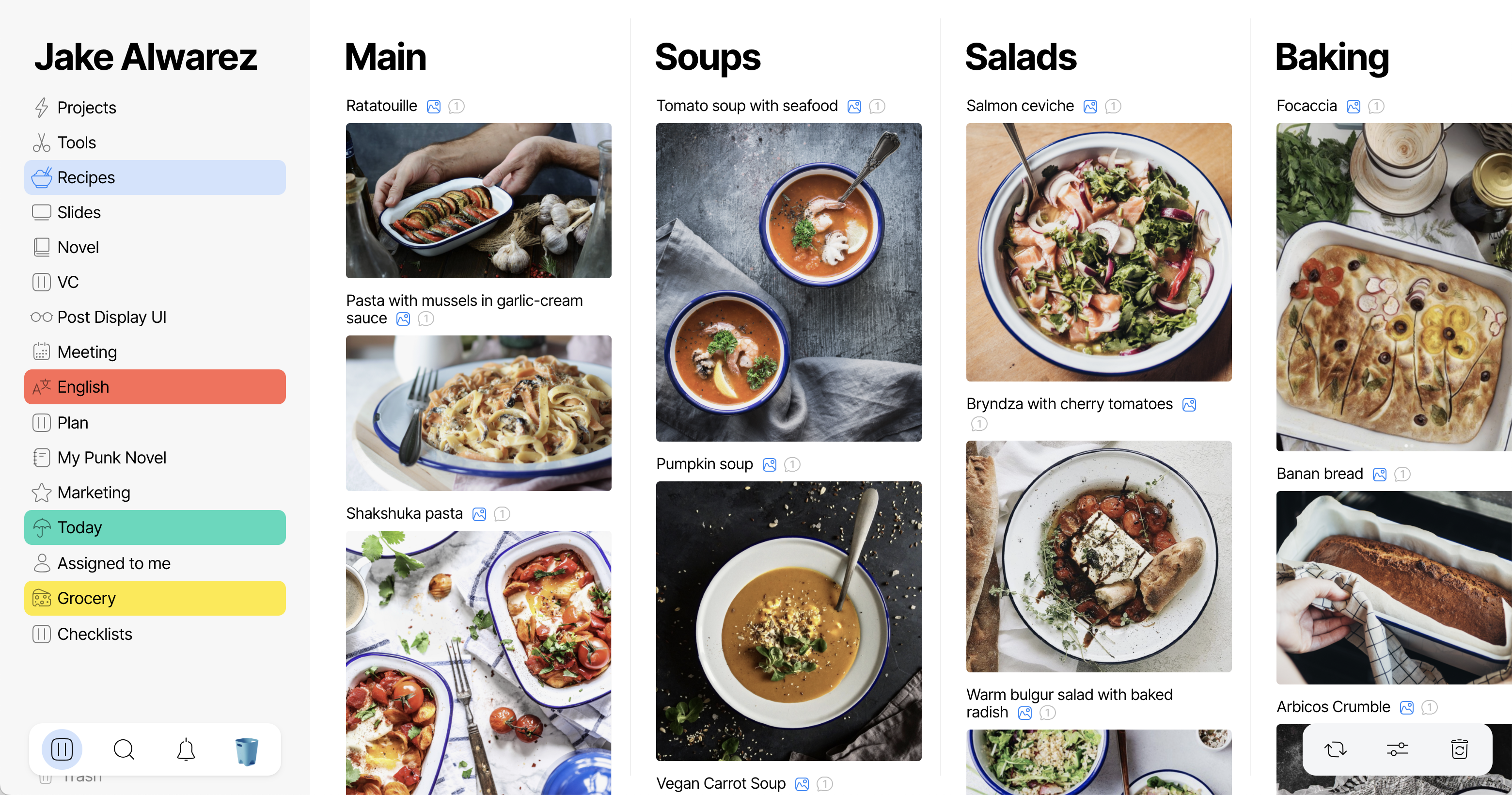
Put all your recipes together
Yeah, we're trying to pretend that it's for real life too.

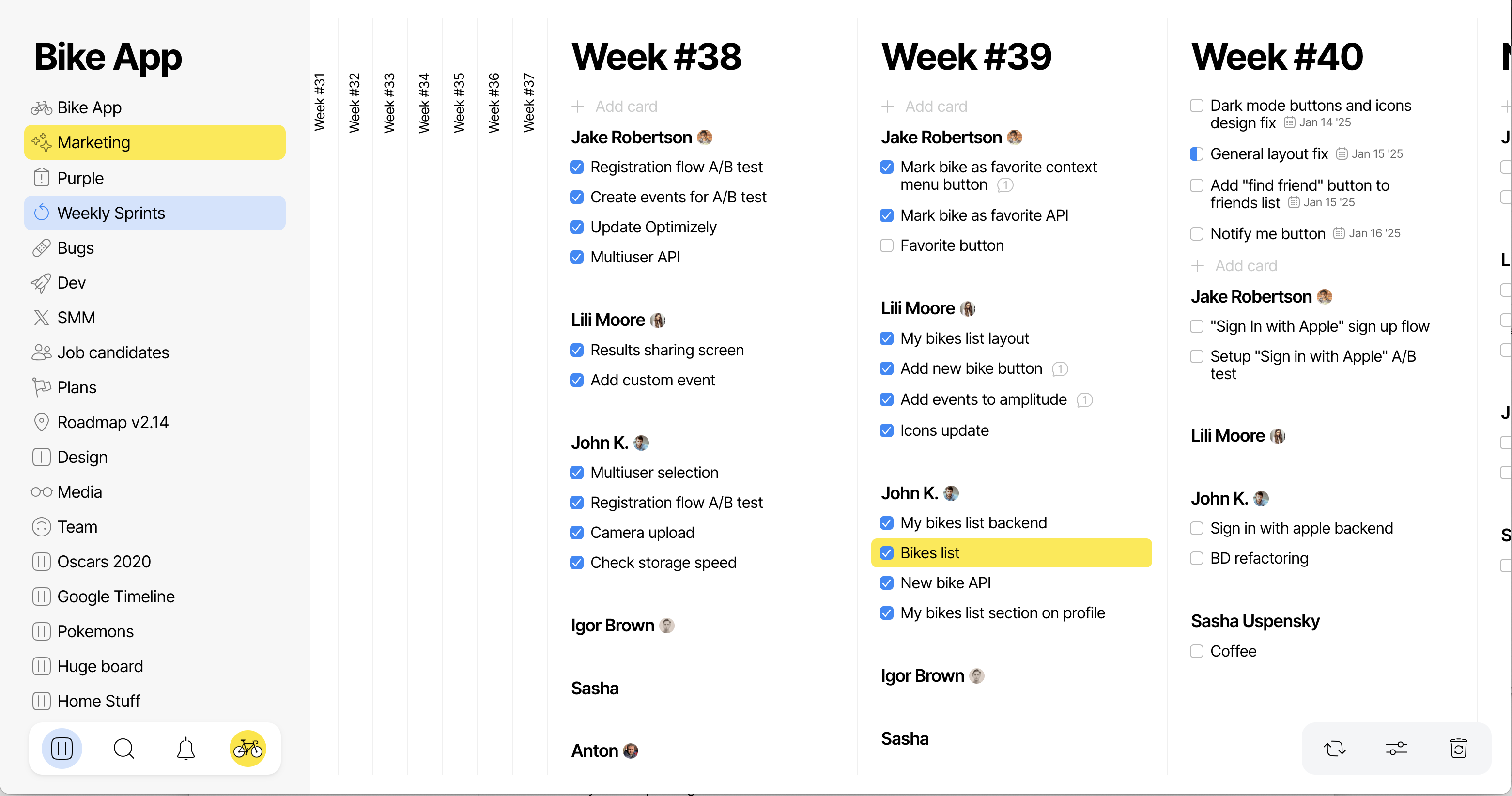
Organize teamwork
Lists are a great way to track progress. Task manager 🤥.
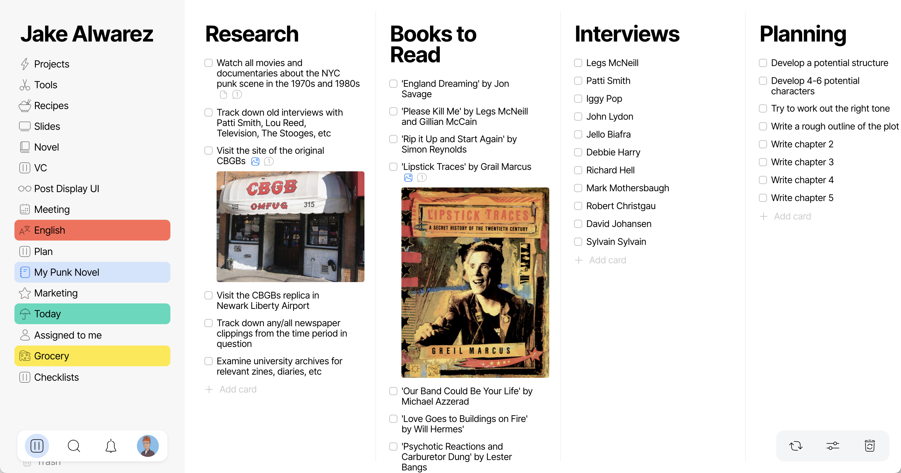
Write a novel
Use lists to outline chapters, track character arcs, and keep your creative process organized.
Make broadcast schedule for a podcast
Plan your weekly keto diet
Make a checklist for recuring project
Manage hiring
List all of pokemons
Plan your wedding tables
And so on!
Use Columns Responsibly.